MFA Media Design Thesis
08 Sep, 2024

Brand Development
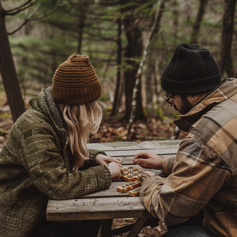
Kinetic Creatives is a speculative brand I developed as part of my Master’s degree project, focusing on sustainable wooden toys and puzzles that engage the mind and body. Drawing inspiration from the natural beauty of the Midwest forests, the brand is designed to encourage hands-on, natural play that blends physical movement with mental stimulation. In this case study, I’ll walk you through the entire process—from the initial research to the problem-solving steps I took to create the brand, and how feedback helped shape and improve it.
Structure of the Case Study
Research and Inspiration:
I’ll start by sharing the research that inspired Kinetic Creatives. This involved exploring current trends in the toy industry, understanding what customers value in toys, and finding a way to make a meaningful connection between nature and play.
Solving Design Challenges:
Next, I’ll dive into the challenges faced in developing the brand’s visual identity. From sketching initial ideas to refining the logo and color palette, I’ll explain how I solved these design problems while staying true to the brand’s core values.
Using Feedback for Improvement:
Lastly, I’ll discuss how feedback played a crucial role in improving the brand. Whether it was refining the logo or tweaking marketing materials, feedback helped me ensure that Kinetic Creatives would resonate with its target audience and stay aligned with its mission.
Through this case study, I’ll show you how I took Kinetic Creatives from concept to a fully realized brand, highlighting the key steps in research, design, and the continuous process of improvement.
Research
Color Palette
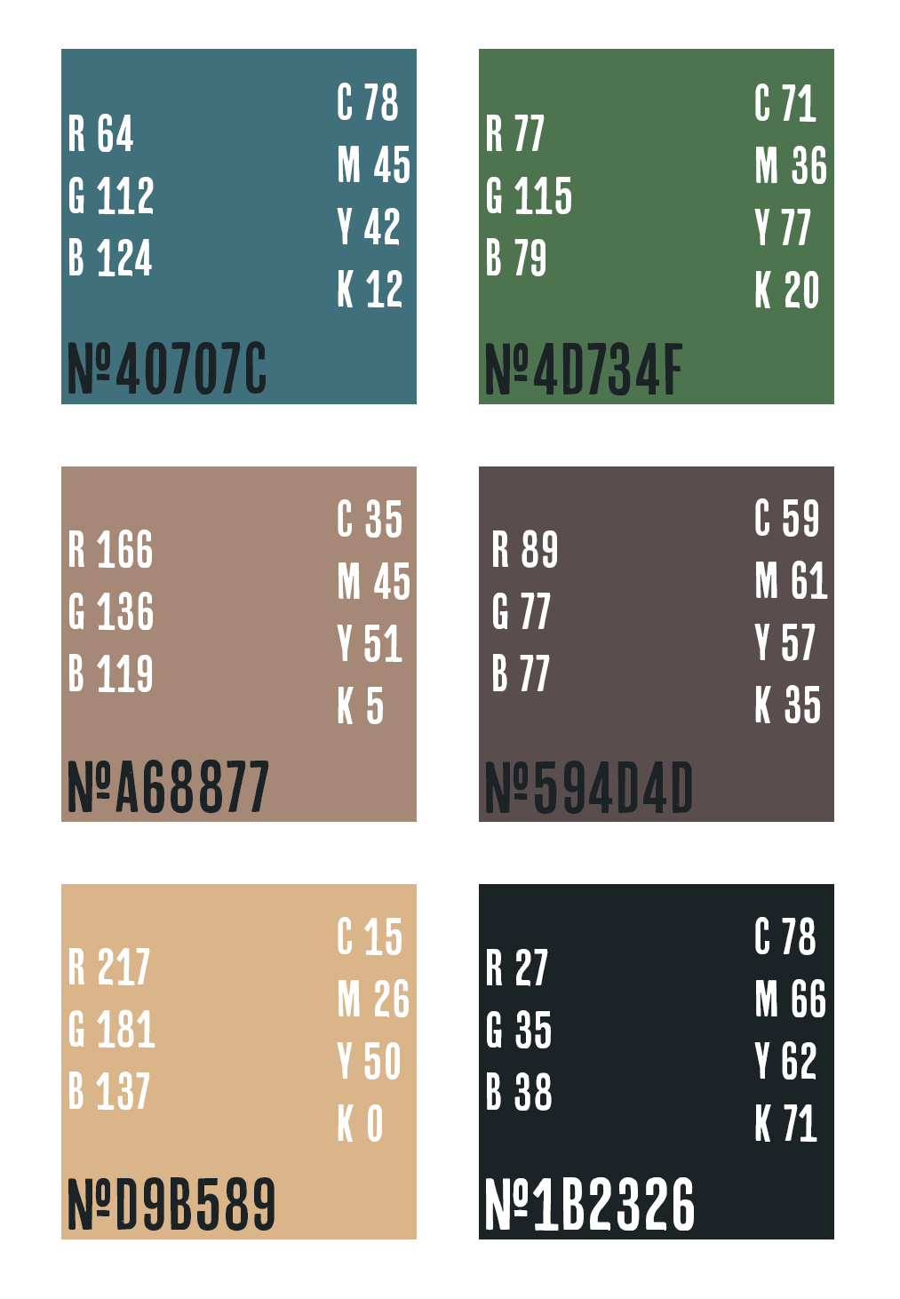
The choice of the color palette was guided by a synthesis of research on color psychology and its impact on consumer behavior.
The decision to use green as a dominant color is due to its association with growth, tranquility, and nature (Van Braam, 2024). This aligns with the brand’s emphasis on sustainability and eco-consciousness. The analysis of blue and its calming and trustworthy qualities provided the rationale for including blue in the palette (Cherry, 2024), aiming to build consumer trust in the brand.
Additionally, the work of Gonigroszek and Szmigiero reinforces the symbolic depth of these color choices (Gonigroszek & Szmigiero, 2021). The abstract interpretation of these colors adds a layer of meaning that resonates with the brand's mission, proving the effectiveness of the color palette in communicating Kinetic Creatives’ core values.
Shapes & Symbolism
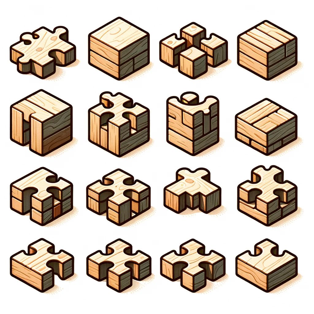
Including a puzzle piece in the Kinetic Creatives logo was not a decision made lightly but rooted in research and thoughtful reinterpretation of the symbol. Traditionally, the puzzle piece has been associated with autism, often carrying controversial connotations. As discussed by Merchant (2023), the symbol has historically been seen by some as problematic because it implies that individuals with autism are "missing" something or need to be "fixed," which has led to significant backlash from the neurodivergent community.
Understanding these sensitivities, the research focused on recontextualizing the puzzle piece to align with the brand's mission of stimulating creativity and fostering connections through play. Drawing on insights into puzzles' cognitive benefits, such as their ability to enhance problem-solving skills and mental engagement (Danesi, 2009), the puzzle piece was reframed not as a symbol of something lacking but as an emblem of challenge, connection, and intellectual curiosity.
This reinterpretation ensured that the puzzle piece would resonate with the brand's identity while avoiding the negative connotations highlighted by Merchant. The final design reflects the brand’s core values without alienating any potential audience by embedding the puzzle piece within a broader narrative of creativity and playfulness.
Font Choice & Texture
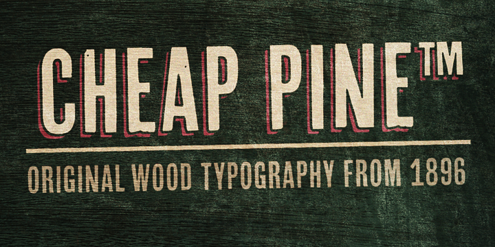
A combination informed the font choice of typography principles and the need to reflect the brand’s handmade, sustainable, and strong design ethos. The selection of the 'Cheap Pine' font, noted for its handwritten appearance, was guided by Mandal’s discussion on font personalities and their alignment with brand identity (Mandal, 2021). This decision was further validated by insights emphasizing how type can be used with visual elements to create texture in designs (Ambrose et al., 2020).
By integrating typography that adds a tactile dimension, the brand achieves a richer, more layered visual identity that enhances the viewer's experience. The combination of these sources proves that the font choice effectively reinforces the brand’s values and creates a compelling visual narrative.
Themes & Kinetic Design
Exploring kinetic creativity, which emphasizes the importance of movement and interactivity in design (Stewart, 2018), inspired the incorporation of kinetic design elements. This approach is particularly relevant for Kinetic Creatives, a brand that aims to engage and stimulate its audience through dynamic products.
The use of fluid and organic shapes further ties the brand to themes of nature and sustainability (Griffin, 2024), enhancing its appeal to eco-conscious consumers. Integrating these elements ensures that the brand’s design is innovative and aligned with contemporary values, proving its effectiveness in engaging the target audience.
Inspiration & Synthesis
The overall inspiration for Kinetic Creatives was drawn from a combination of modern design principles and the tactile engagement of puzzles and games. Art of Play significantly influenced the brand’s focus on merging art with functionality, showcasing the importance of creativity and playfulness in design (Buck & Buck, 2024).
This inspiration was synthesized with insights on incorporating natural and organic elements (Griffin, 2024) and abstract symbolism (Gonigroszek & Szmigiero, 2021), leading to a cohesive and meaningful brand identity. The successful blending of these sources into the brand’s visual language proves that the design effectively communicates its values and resonates with its intended audience.
Solving Problems
Problem Statement
Kinetic Creatives’ initial brand concepts were either too childish or generic or failed to capture the brand’s connection to nature and the Midwest, which would not connect with their target audience. To resolve this, Kinetic Creatives needed a strong brand identity to stand out in the market for adult-focused kinetic puzzles and games. Developing a new brand allows Kinetic Creatives to reach an underserved market and connect with adult consumers.
Process
The solution began with a clear understanding of what Kinetic Creatives should represent. The project started with the crafting of an onlyness statement that captured the unique value the brand would bring—connecting with adults through a blend of creativity, natural elements, and kinetic play. This statement served as the foundation for all subsequent steps.
Initial iterations focused on blending handcrafted wooden toys with a connection to Midwest nature, emphasizing eco-friendly and tactile experiences. These versions were broad and lacked specificity.
The statement was refined to highlight the brand's unique value—offering physical and mental stimulation with natural play. The process involved several key steps: starting with broad concepts, identifying core values like stimulation and sustainability, refining the message for clarity, and iterating based on feedback. The final iteration clearly defines Kinetic Creatives as promising a blend of mental and physical stimulation rooted in the essence of Midwest forests.
Initial Statement
Kinetic Creatives offers a unique blend of vintage-inspired, handcrafted wooden puzzles and kinetic games, designed to stimulate both mind and body. Rooted in the natural beauty of the Midwest forests, our products are not just toys but tools for connection and creativity, bringing families and friends together in meaningful ways.
Revised Statement
Kinetic Creatives provides a uniquely stimulating experience by offering expertly crafted, sustainable wooden toys and puzzles. Our designs blend mental challenges with physical engagement, allowing users to immerse themselves in tactile play while solving intricate puzzles. Each product offers a natural, hands-on approach to learning and fun, fostering a connection between mind and body that keeps both engaged. This unique stimulation sets Kinetic Creatives apart, offering toys for sustainable, eco-friendly play.
Vision Board
In developing the vision board, the initial design incorporated boxed shapes to hold photos and text, aiming for a clean and organized look. However, this approach quickly proved too restrictive. The rigid structure of these boxes limited the flow and energy that the brand needed to convey, stifling the sense of creativity and momentum central to the Kinetic Creatives identity.
On the other hand, the color palette was carefully crafted by pulling earth tones and muted greens and browns directly from a photo of the Midwest (Geeck 2022). These colors perfectly captured the natural environment that inspired the brand, grounding the visual identity in the essence of Midwest forests. While the palette was aligned with the brand’s connection to nature, the boxed design elements did not allow the vibrant and dynamic nature of the brand to shine through.
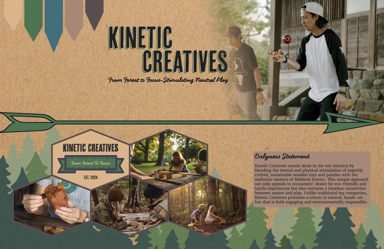
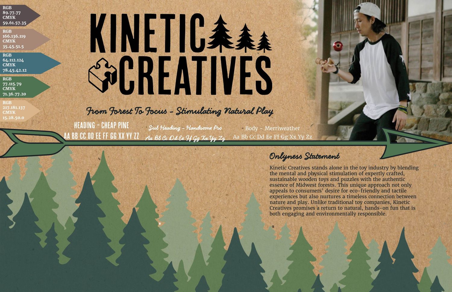
The design was reimagined to break free from the restrictive boxed shapes. The boxed shapes were removed, the onlyness statement was placed directly on the design without a background color, and the color palette was moved toward the brand's logo, guiding the viewer's eye further into the design. By allowing more fluid and organic layouts, the vision board began to reflect the lively and engaging experience that Kinetic Creatives aimed to provide. This shift in design enhanced the visual representation of the brand's momentum. It allowed the earthy color palette and eco-friendly textures to complement, rather than confine, the overall brand narrative.
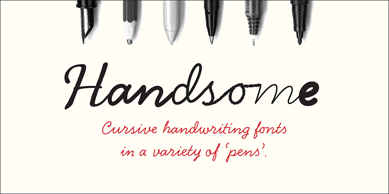
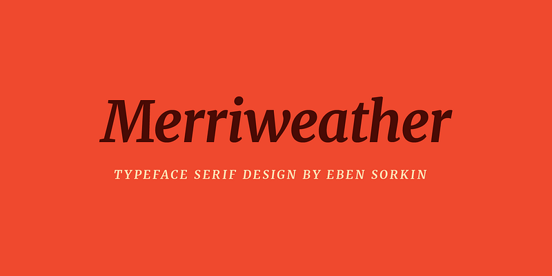
Choosing the fonts for Kinetic Creatives was driven by a desire to reflect the brand's handmade, sustainable, and strong design ethos through typography. 'Cheap Pine' was selected for titles, headings, and the logo due to its handwritten, organic appearance, which aligns with the brand's identity. This decision was guided by Mandal’s exploration of how font personalities can reinforce brand identity (Mandal, 2021). Additionally, insights from Ambrose et al. (2020) on the use of typography to create texture and depth in designs influenced the integration of 'Handsome Pro' for subheadings and decorative elements and 'Merriweather' for body copy, ensuring both visual appeal and readability. Combining these fonts effectively enhances the brand's narrative, creating a cohesive and layered visual identity.
Logo Design
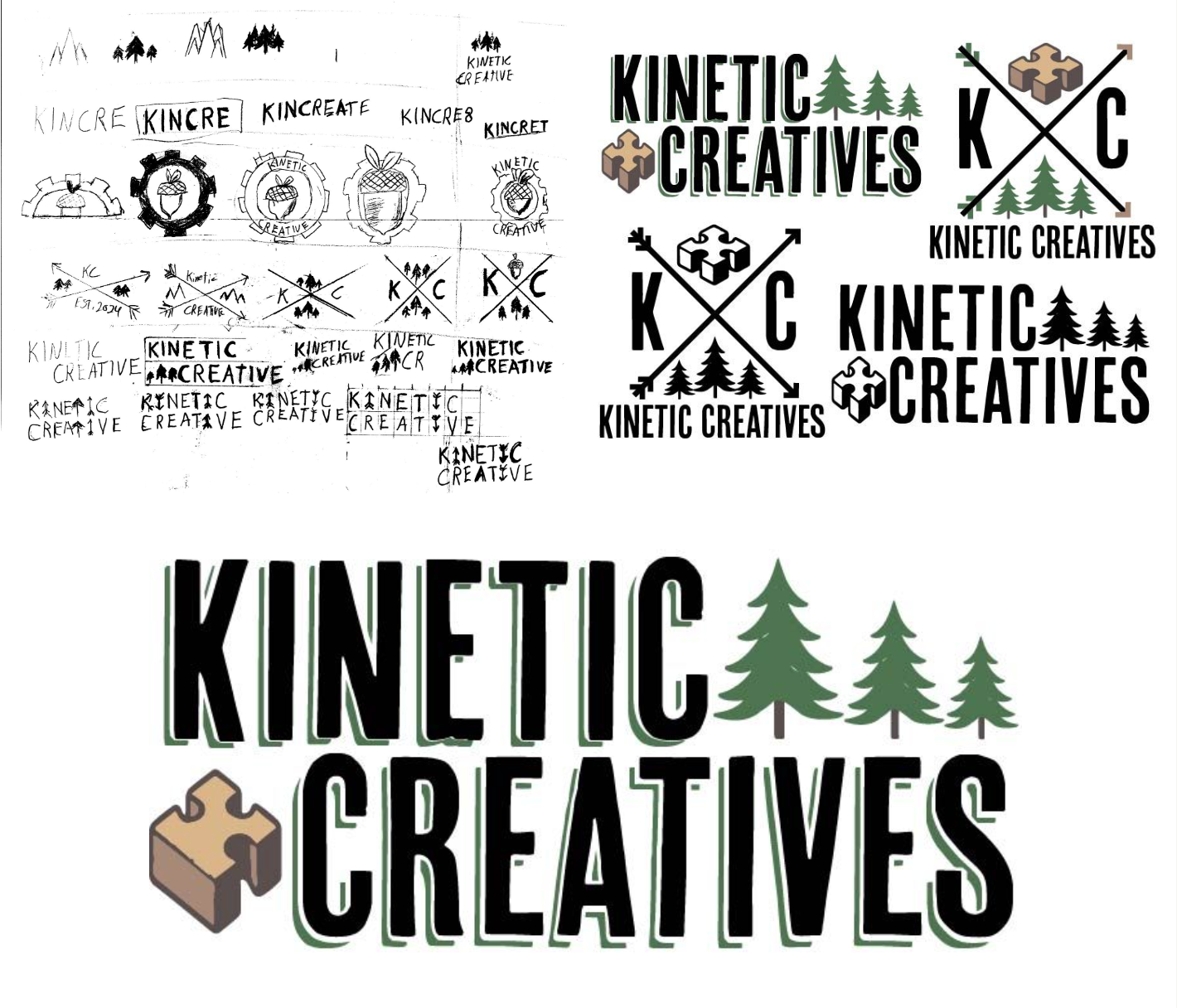
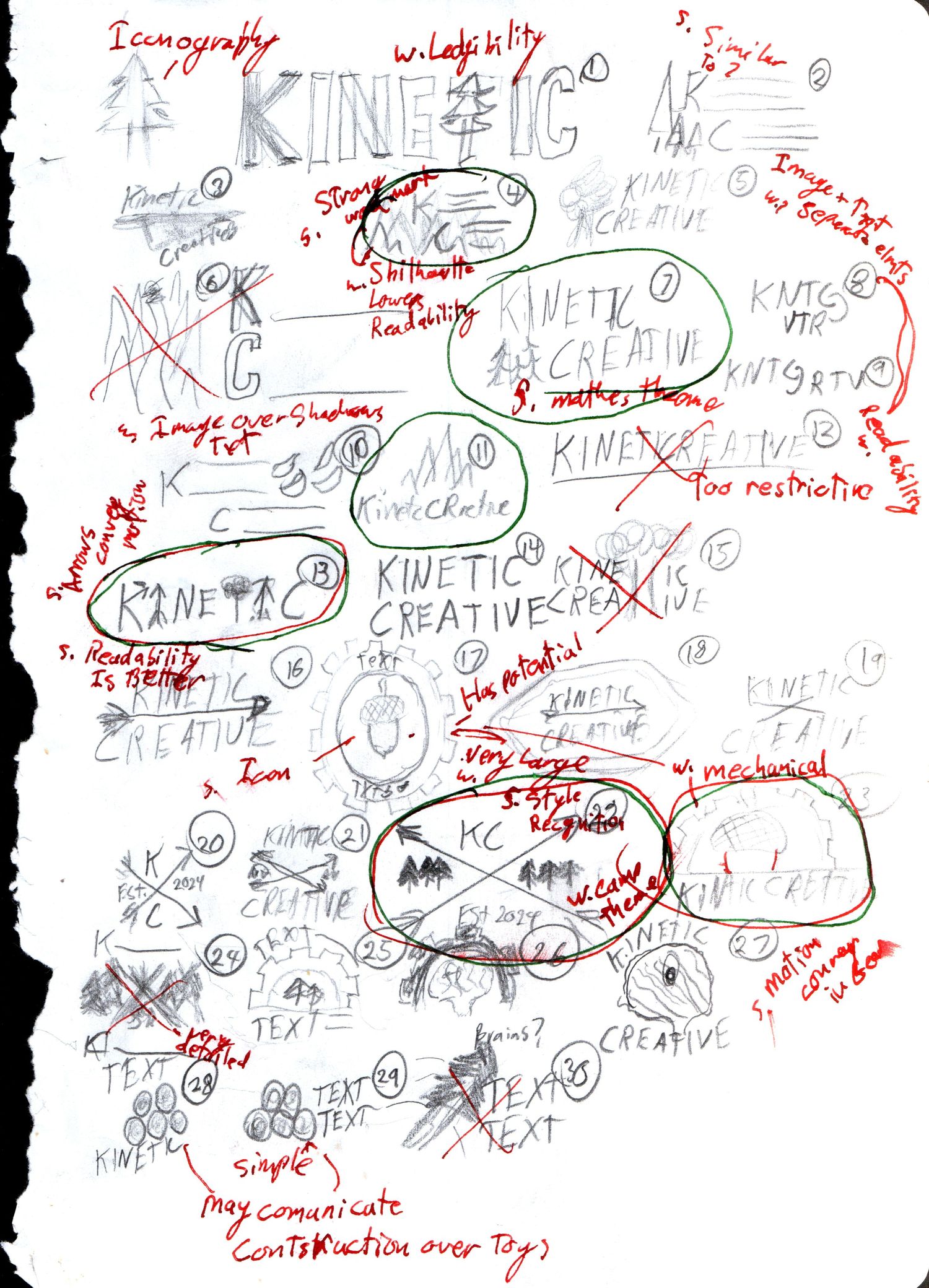
The next step was creating a logo representing the brand’s identity. The process began with sketches, including ideas like incorporating a gear and altering the wordmark letters. However, these designs were rejected because they did not align with the brand’s core values and reduced legibility.
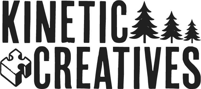
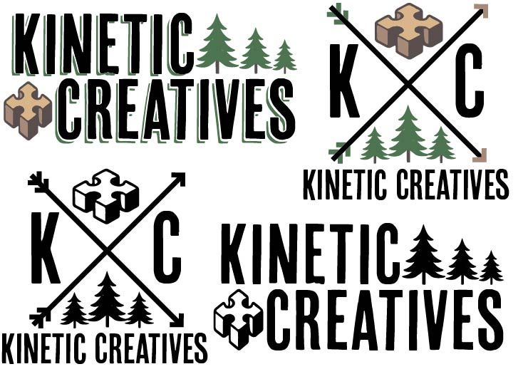
After refining the concepts, two final designs emerged: a wordmark featuring trees, a puzzle piece, and another with crossed arrows and symbols. Given the brand's need for recognition, the wordmark was chosen as the primary logo, while the crossed arrows were kept as a secondary asset. This ensured a clear and recognizable visual identity as Kinetic Creatives entered the market.
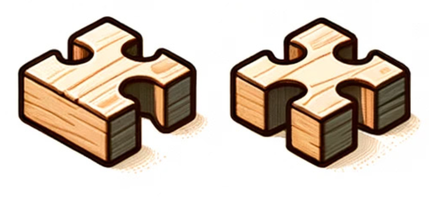
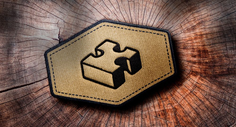
During the evaluation process, the wordmark underwent further refinement. It was pointed out that the original illustration of the puzzle piece resembled a cross, which led to the decision to modify the design. To better align with the brand, the puzzle piece was reshaped to resemble a "K," ensuring the logo remained faithful to the brand's identity while avoiding any unintended symbolism.
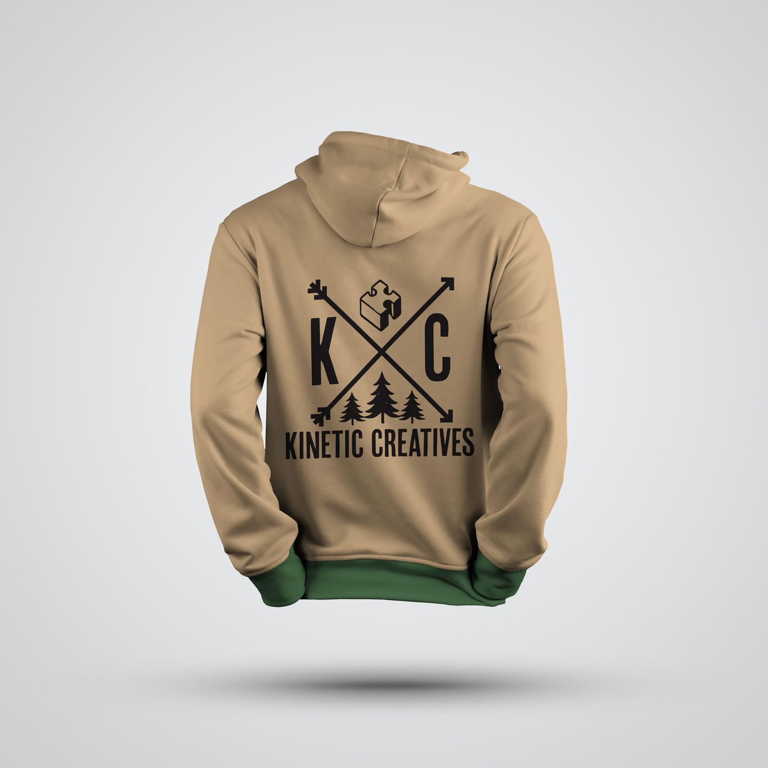
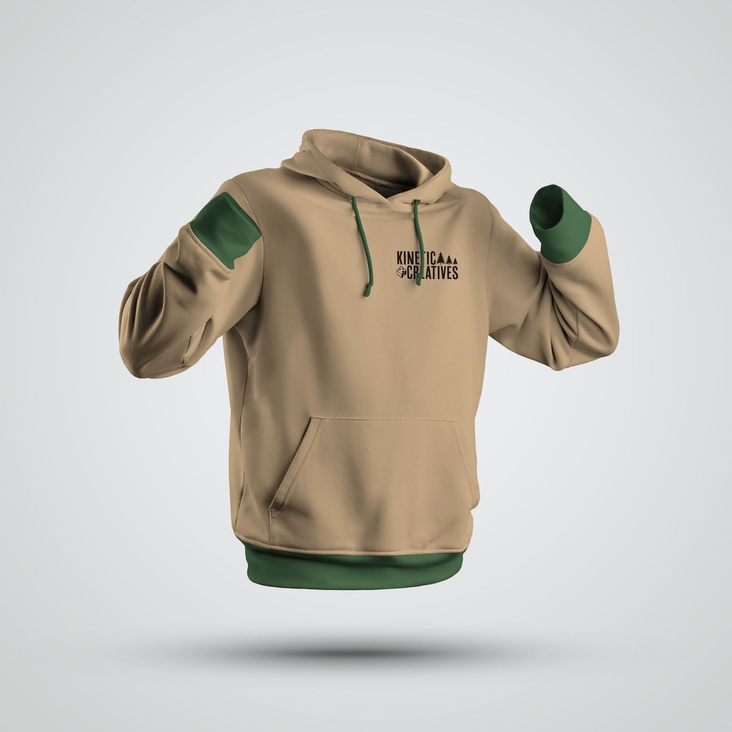
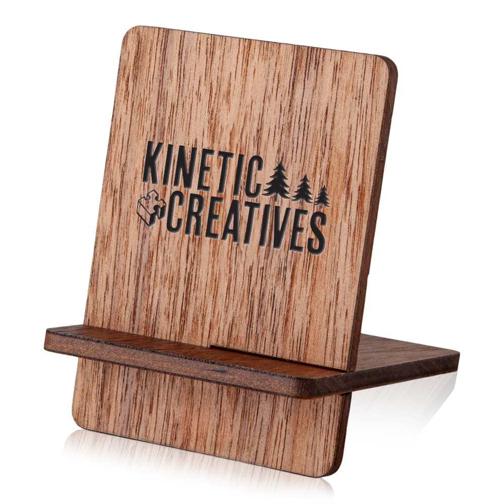
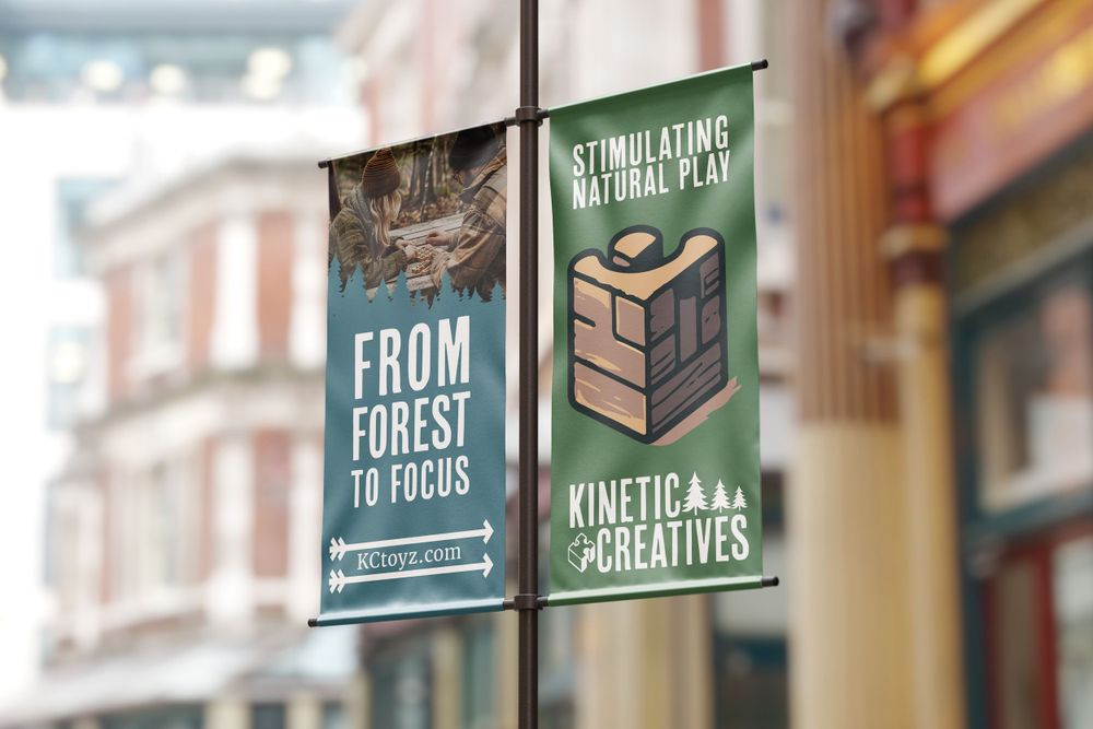
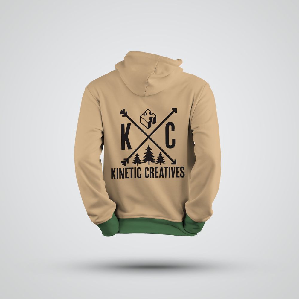
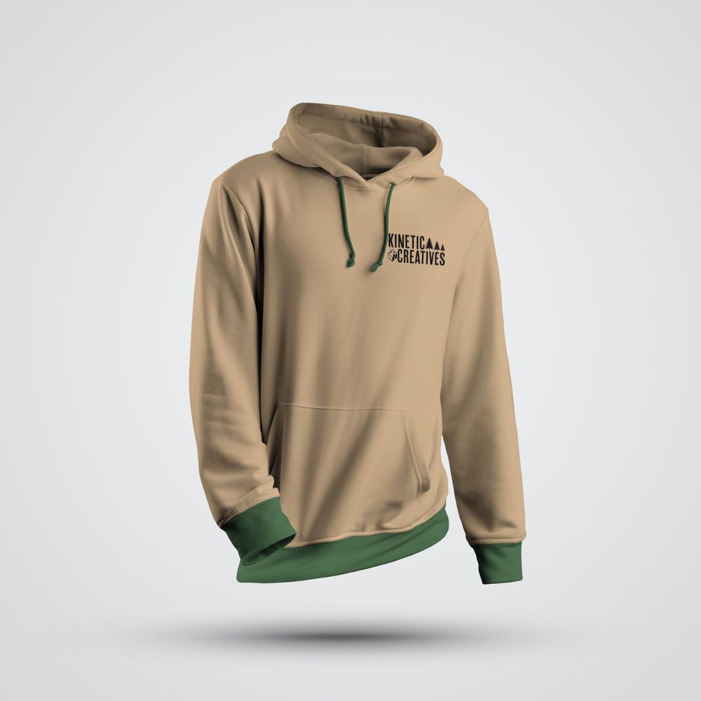
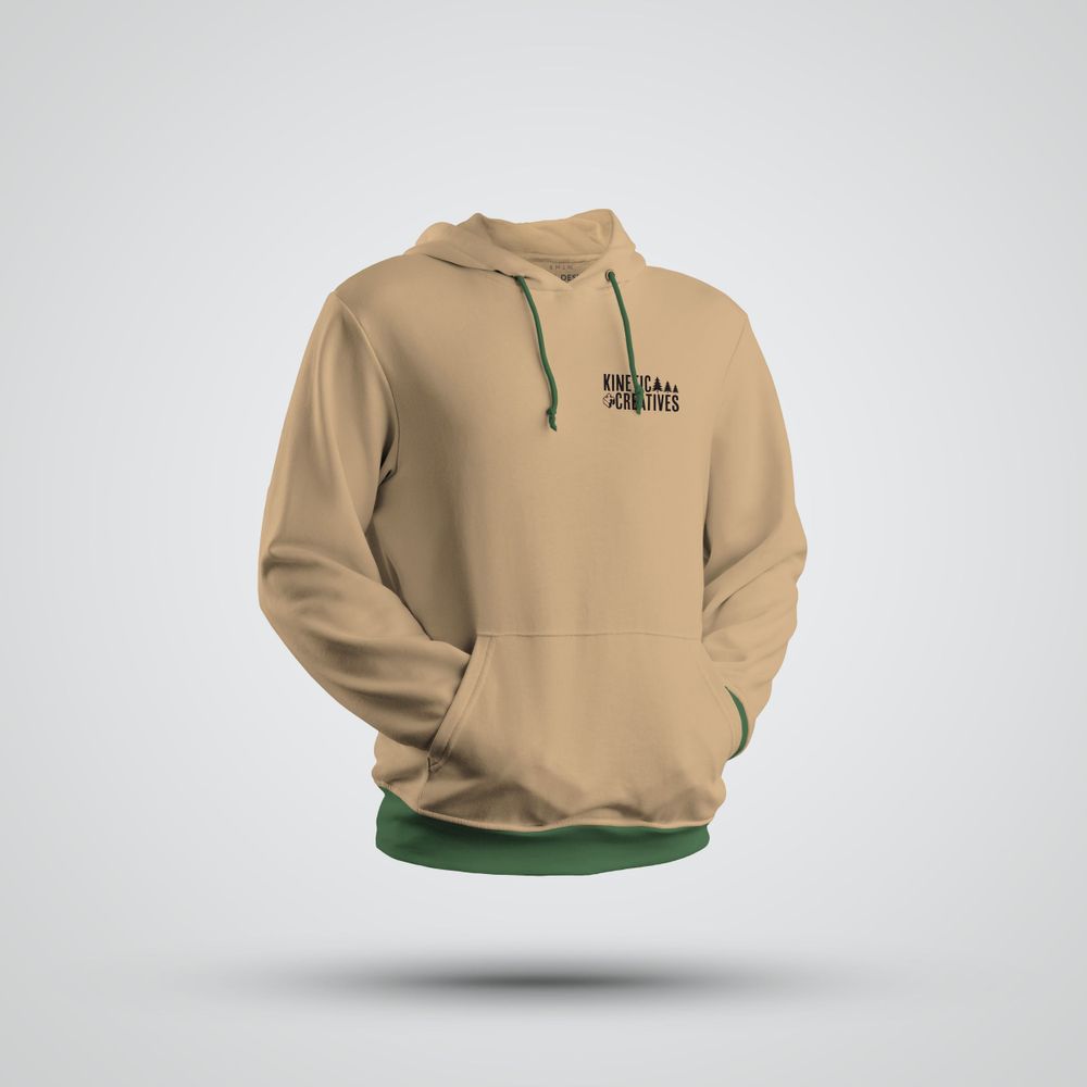
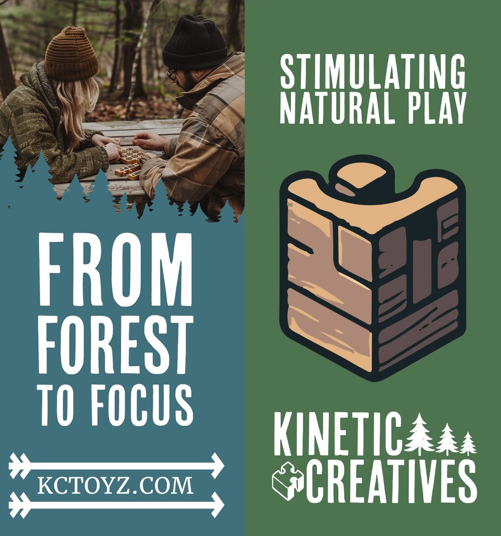
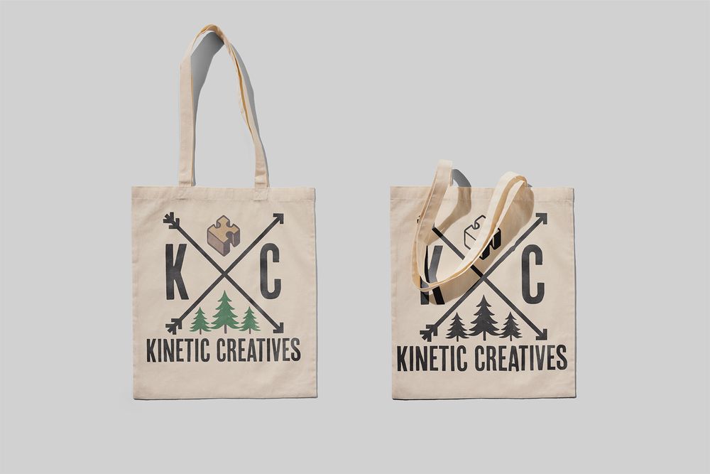
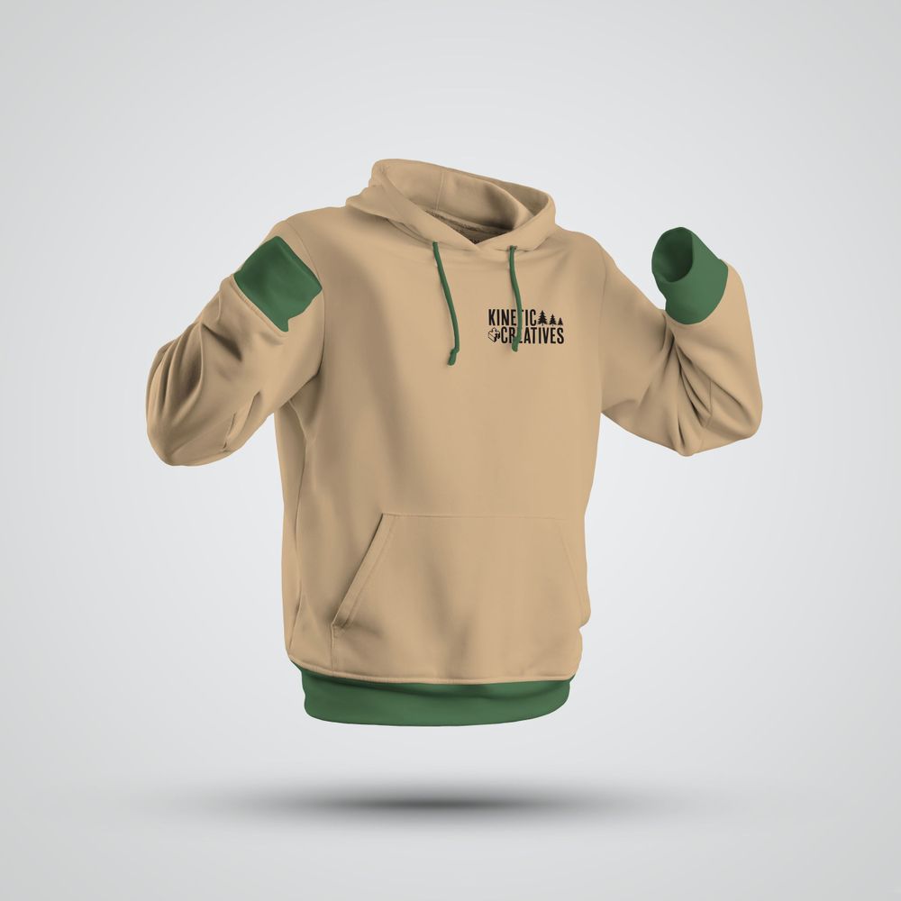
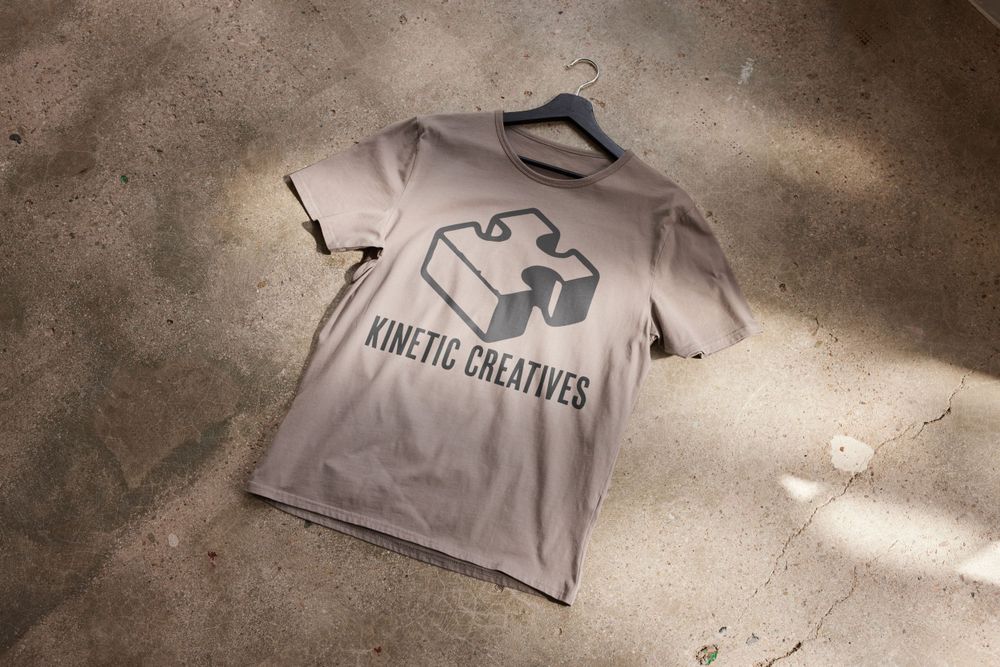
Refining the logo and building a solid vision board made creating designs for promotional items like apparel and marketing banners easy. The assets developed during the logo creation were seamlessly applied, ensuring a cohesive and consistent brand identity across all marketing materials.
Texture and Shapes
To further emphasize the natural and sustainable ethos, kraft paper texture is used as a backdrop throughout the brand's materials. This texture subtly hints at raw, unrefined natural elements, reinforcing the brand’s environmental consciousness (Rawpixel.com, 2024). The tactile quality of the kraft paper invites a sensory connection, much like the wooden toys and puzzles the brand offers. It signals to eco-conscious consumers that Kinetic Creatives is as much about the experience of nature as it is about play.
In terms of layout, the brand steers away from rigid, boxed designs, opting instead for fluid, organic shapes that mirror the unconfined beauty of the outdoors. This approach avoids the conventional grid and promotes a sense of freedom and movement, which ties directly to the kinetic nature of the brand’s toys (Argo & Baldowski, 2024). The dynamic arrangement of elements mimics the flow and unpredictability of nature, aligning the visual design with the brand’s core values of movement, creativity, and natural play.
Feedback
Vision Board Feedback
The feedback on the initial vision board revealed significant areas for improvement, particularly regarding layout, missing elements, and visual flow. The boxed elements, especially at the bottom, created a sense of clutter that detracted from the openness and fluidity of the design. This clutter made the overall composition feel dated and disconnected from the intended brand theme of nature, motion, and openness. The feedback emphasized the need to apply the "less is more" principle to simplify the design and better align with the brand's core message. In response, the boxes that constrained text and visual elements were removed, and the layout was realigned to follow a more open structure. Specifically, the hexagon design at the bottom and the box around the Onlyness statement were eliminated, allowing the tree silhouette and the statement to become focal points. This adjustment not only resolved the issue of clutter but also brought the design more in line with Kinetic Creatives' theme of natural motion, creating a cleaner, more focused visual identity.
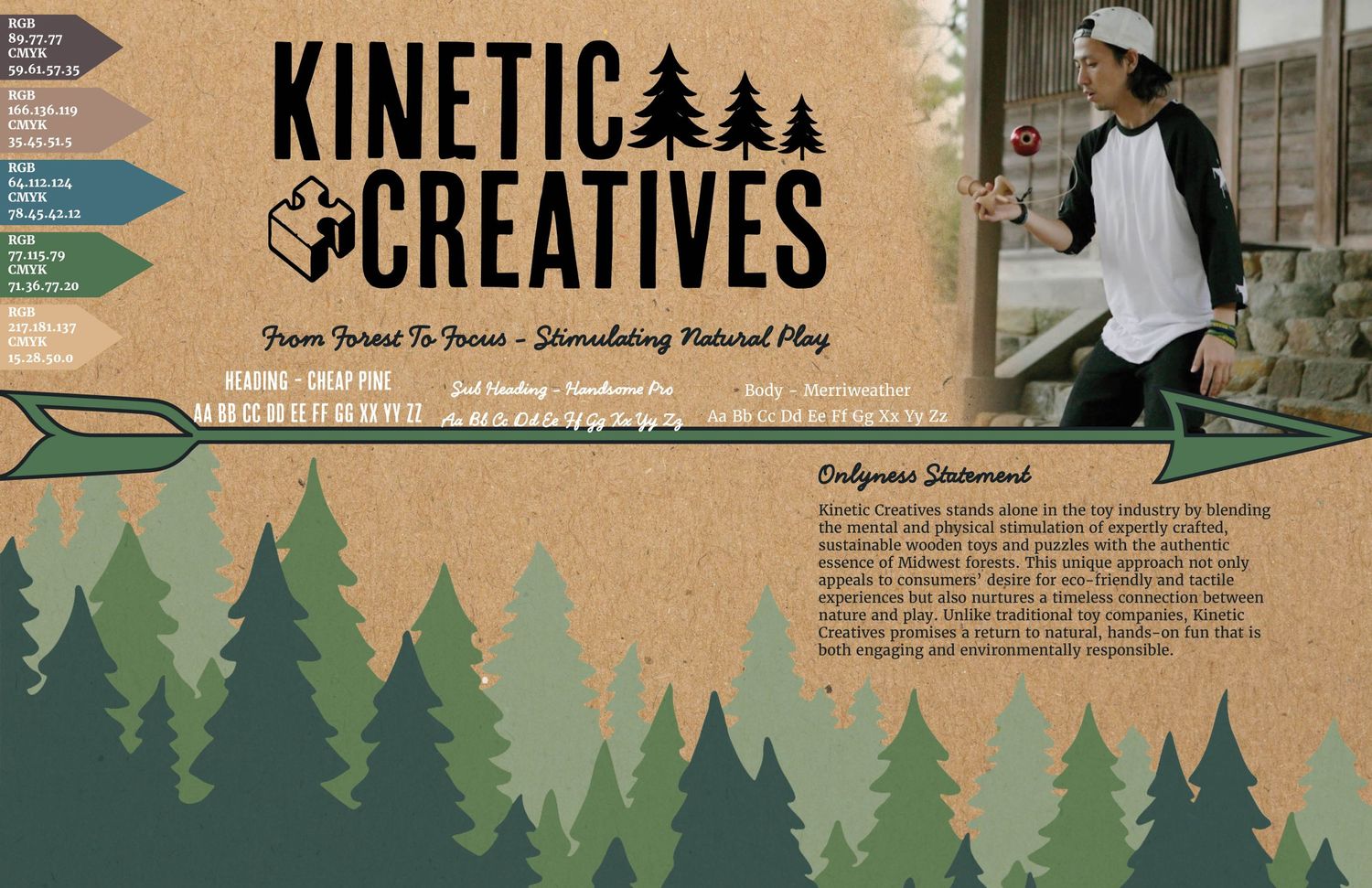
The absence of color palette codes and font choices was another significant point raised in the feedback. These elements are essential for guiding the design process and ensuring brand consistency across all materials. Without them, the vision board lacked a critical foundation, which could have led to inconsistencies in future design decisions. Recognizing the importance of these elements, color codes and font selections were added to the vision board. This inclusion provided a stronger framework for all future creative decisions, ensuring that every visual element adhered to the brand's identity and values. These additions reinforced a cohesive, unified look for Kinetic Creatives, grounding the design in a clear visual direction.
Upon reflecting on the design flow, it became evident that the placement of visual elements, especially the arrows intended to represent motion, was problematic. The original design directed the viewer’s eye downward, away from key content like the title, diminishing the overall impact of the layout. This misalignment contradicted Kinetic Creatives' brand identity, which emphasizes motion, engagement, and the seamless flow between mental and physical stimulation. Drawing from principles of visual design, such as leading lines, the arrows were repositioned to direct the viewer’s gaze towards the wordmark. This new arrangement guided the eye through the hero image and down to the Onlyness statement in a natural, engaging flow. The revised design created a more cohesive visual narrative that aligned with the core values of Kinetic Creatives, enhancing both the viewer’s experience and the overall impact of the vision board.
Logo Sketches
During the initial stages of the logo design, self-evaluation revealed that many of the themes and directions explored in the sketches did not align with the brand’s goals and overall theme. The use of a gear icon, in particular, was deemed too modern and mechanical, which constrained the text and diverged from the brand’s intended identity.
The decision was made to focus on a simpler wordmark that would better suit a new brand and be more recognizable (Mayrhofer, 2024), incorporating elements reflective of the Midwest forest theme. As a result, trees and an acorn image were integrated into the design, helping to balance the logo and create a sense of motion by offsetting the text. The gear motif was subsequently discarded in favor of this more cohesive and aligned design direction.
Proper Identity
After finalizing the wordmark design, peer evaluation raised a critical question: Does this logo communicate "Toy company"? The overwhelming consensus was that nothing about the logo clearly conveyed a toy brand.
Given that these peers were part of the target demographic rather than designers, their feedback was invaluable in ensuring the brand resonated with its intended audience. This evaluation highlighted a misalignment that needed to be addressed to strengthen the brand's identity.
The feedback was accepted, leading to the replacement of the acorn with a puzzle piece motif. The use of a puzzle piece is particularly meaningful, as it resonates with the psychological connection between puzzles and cognitive stimulation, a key aspect of the brand's offerings (Danesi, 2009). This change not only better aligned the logo with the brand’s identity as a toy company rooted in the Midwest but also effectively communicated the brand's core values and purpose to its audience.
Misread Shape
During a live discussion, it was pointed out that the original puzzle piece shape and its orientation resembled a Christian cross. The concern was that, without a connection to the brand, this could lead to unintended communication.
This feedback, offered by a peer who is also a designer, was particularly compelling, as it highlighted a potential issue that could weaken the brand's identity. The suggestion to change the orientation of the shape was also considered.
Ultimately, a different shape was chosen to prevent any miscommunication. The new puzzle piece was designed to resemble the letter "K," which not only resolved the initial concern but also strengthened the brand’s identity by creating a distinctive icon that could be used in future brand assets.
Camp Theme
During the prototyping phase, feedback was received that the crossed arrows logo, featuring icons with the company's initials, evoked a "summer camp" theme.
While this association wasn't necessarily negative and still aligned with the Midwest forest theme, it did not significantly strengthen the brand's identity. The design, although fitting, was not considered memorable enough to serve as the primary logo (Mayrhofer, 2024).
As a result, this feedback led to the decision to scrap the crossed arrows logo as the main brand logo. Instead, it was relegated to a secondary asset, intended for use on items like clothing and promotional materials, where it could still contribute to the brand without being the primary identifier.
References
Argo, B., & Baldowski, A. (2024). Full sail online. Full Sail Online Login. https://online.fullsail.edu/class_sections/186403/meetings/87968/recordings.
Ambrose, G., Harris, P., & Theodosiou, S. (2020). The Fundamentals of Typography (3rd ed.). Bloomsbury Visual Arts.
Buck, D., & Buck, D. (2024). Wonder emporium. Art of Play. https://www.artofplay.com/
Danesi, M. (2009, April 9). Puzzles and the brain. Psychology Today. https://www.psychologytoday.com/us/blog/brain-workout/200904/puzzles-and-the-brain
Cherry, K. (2024, February 20). How the color blue impacts moods, feelings, and behaviors. Verywell Mind. https://www.verywellmind.com/the-color-psychology-of-blue-2795815
Fussell, G. (2024, July 22). Earth color palette: Using earth colors in your designs. The Shutterstock Blog. https://www.shutterstock.com/blog/design-earth-colors-palette
Geeck, R. D. (2022). Spring Hike. photograph, Oxford Mi.
Gonigroszek, D., & Szmigiero, K. (2021). Metaphorical meanings of colour in abstract art. Social Semiotics, 33(3), 497–514. https://doi.org/10.1080/10350330.2021.1885287
Graphics, S. (2019, May 20). Control A Viewers Eye For BETTER Graphic Designs (Professional Tips). YouTube. https://www.youtube.com/watch?v=dTsWYQawXRw
Griffin, J. (2024, January 17). Embracing nature: The rise of fluid and organic design elements in graphics. LinkedIn. https://www.linkedin.com/pulse/embracing-nature-rise-fluid-organic-design-elements-graphics-griffin-vmure/
Justine, D. (2023, October 31). Less is more: A design trend or a design principle?. Medium. https://bootcamp.uxdesign.cc/less-is-more-a-design-trend-or-a-design-principle-8ba67529518a
Mandal, R. (2021, November 9). The Ultimate Guide to Choosing Your Brand Fonts. Visme Blog. https://visme.co/blog/brand-fonts/#types-of-brand-fonts-and-their-personalities
Mayrhofer, E. (2024, April 24). What is a word mark and how is it different from a logo? - web designer: München: Website in a day: Eleanor Mayrhofer. Web Designer | München | Website In A Day | Eleanor Mayrhofer. https://www.eleanormayrhofer.com/blog/what-is-a-word-mark-and-how-is-it-different-from-a-logo
Merchant, Z. (2023, February 10). The puzzle piece symbol and autism: Why it’s controversial. Cloudberries. https://www.cloudberries.co.uk/news/the-puzzle-piece-symbol-and-autism-why-its-controversial/
Noss, R. (2024). Upper Midwest US forest-savanna transition. One Earth. https://www.oneearth.org/ecoregions/upper-midwest-us-forest-savanna-transition/
Rawpixel.com. (2024, April 19). Sustainable graphic design: Tips to create eco-friendly designs. Medium. https://medium.com/@rawpixel/sustainable-graphic-design-tips-andtricks-13bb47c4a49f
Shuttleworth, L. (2024, July 18). Swag for marketing: How swag can skyrocket your brand [2024]. P2P marketing. https://peertopeermarketing.co/marketing-swag/
Stewart, T. (2018, March 9). Kinetic creativity. LinkedIn. https://www.linkedin.com/pulse/kinetic-creativity-trevor-stewart/
Van Braam, H. (2024, March 4). Green color psychology, symbolism and meaning. Color Psychology. https://www.colorpsychology.org/green/